
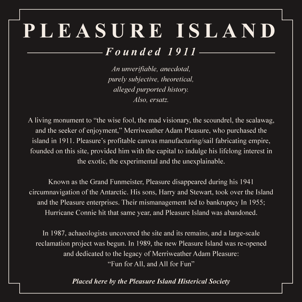
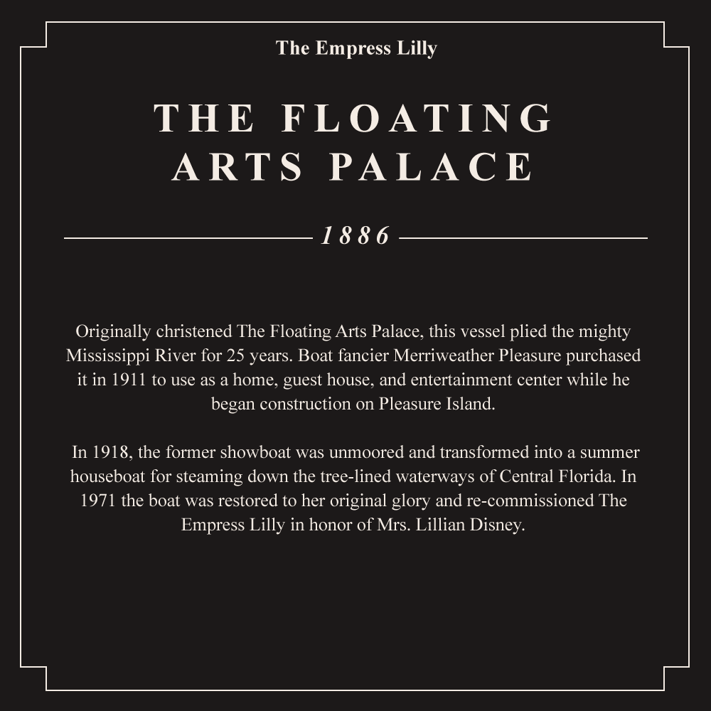
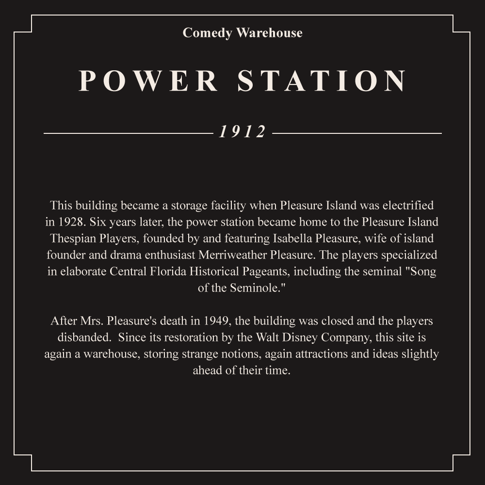
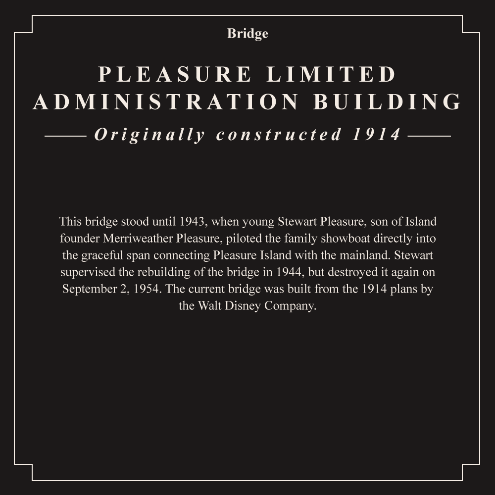
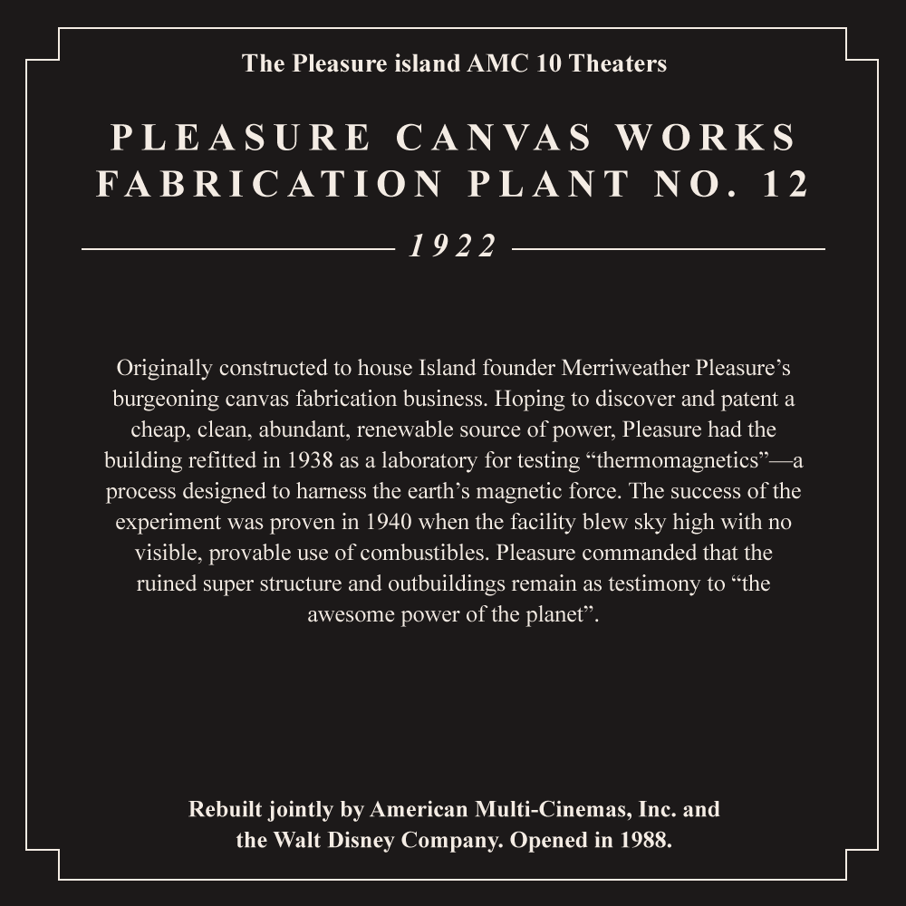
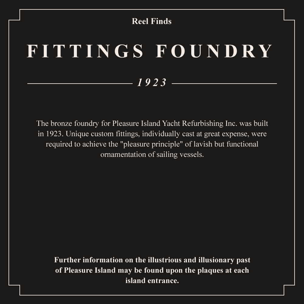
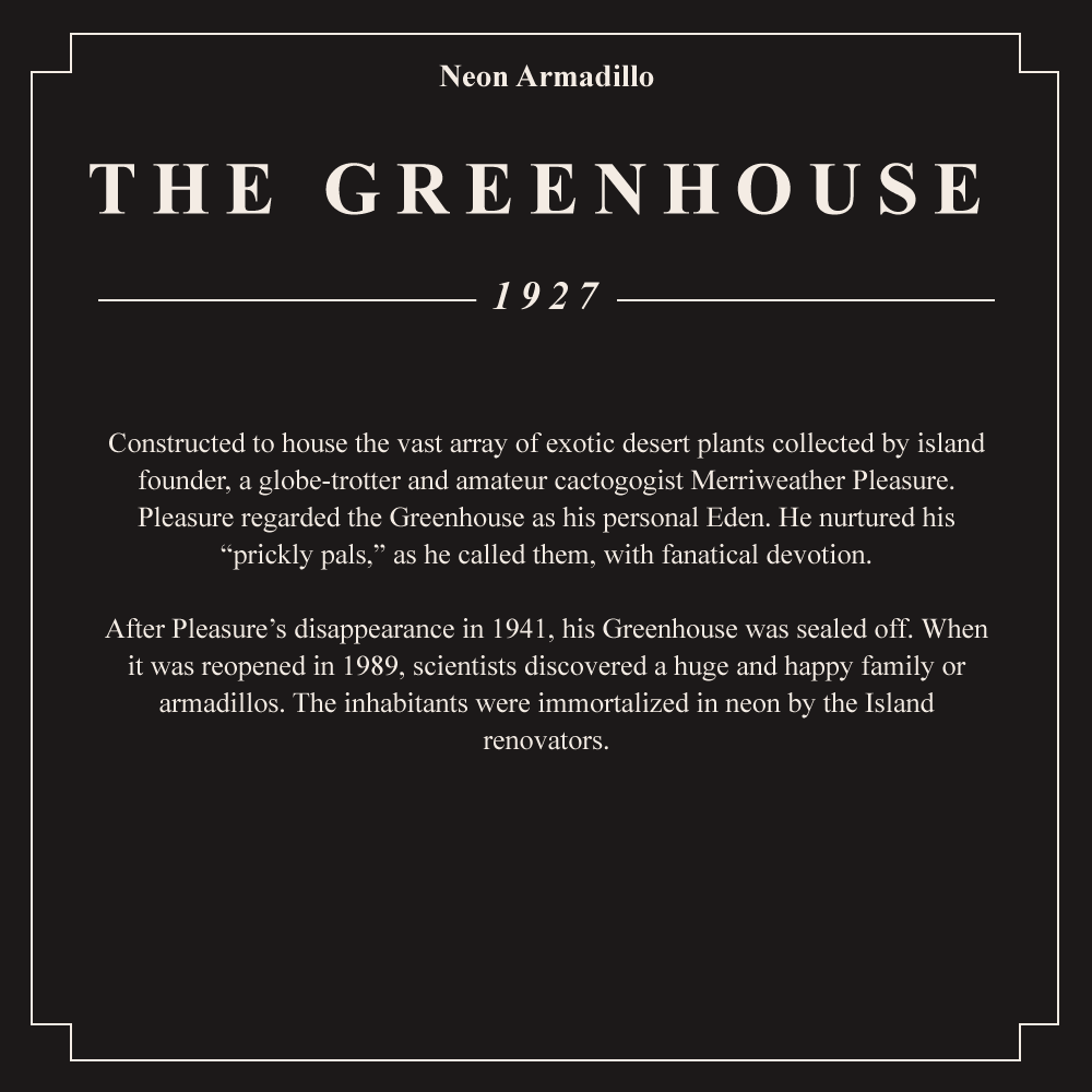
The backstory to Downtown Disney's infamous Pleasure island was conveyed through elusive plaques, erected by the diligent but unreliable "Pleasure island Histerical Society" and posted at the entrance to each building. Here they are, recreated in their entirety, read tales of sentient robots, physics-defying locomotives and even extraterrestrials!
Walt Disney World


Behind The Scenes: Wonders of Life Placemat
Background
I have a fascination with Disney parks, particularly extinct attractions. The Wonders of Life pavilion is especially interesting to me because it’s tantalisingly still there for the most part, albeit under buckets of white paint.
For me it was an oddball time capsule of the 1990s, with vibrant colours, oversized toy-block constructions and an overarching “Midway of Life” carnival aesthetic you could browse while Yanni music played in the background.
I wanted to create a design that celebrated all of the pavilion’s offerings, from the E-Ticket Body Wars ride, right down to the Wonder Cycles and the quirky exhibits of the Sensory Funhouse. Not only that, but do it in a style that fit the feel and time period it inhabited.
This led me to the placemat activity sheets I’d see at McDonalds birthday parties as a kid, so merging all these elements became a complete nostalgia kick. Plus it was a lot of fun coming up with a Cranium Command themed word jumble and a Body Wars maze.
The colour scheme was based on Sussman & Prejza’s early work for Euro Disney in 1992; Deborah Sussman’s work on the 1984 Los Angeles Olympic Games had a huge impact on 90’s graphic design, and her iconic geometric confetti makes an appearance on the placemat also.
Process
I started with a lot of research; old Disney park maps, 90’s food packaging, McDonald’s placemats as well as photos of the pavilion.
1997 EPCOT Map
Map of McDonaldland Placemat
I then did some exploratory sketches of a Wonder Cycle, the oversized headphones of Audio Antics and a sketch of a young batter at Coach’s Corner. Then using a photo overlooking the whole pavilions, I started drawing up a rough map, working out where each exhibit, tree and lamppost stood.
From this rough sketch I did a more detailed drawing to get all of the elements in, which I then scanned and began tracing on Illustrator; tracing, especially on such a detailed design is extremely time consuming and fiddly. At this point I played around with the peripheral elements, and added a maze, word jumble and other details.
Finally, I had a black and white line drawing which was ready for colour; this was surprisingly hard to get right – too blocky and you lost the details, too elaborate and it looks messy. After about three iterations I was happy with the look.
I’m really happy with the finished piece, it accomplished what I set out to do: create a record of all of the pavilions offerings in a fun format, and designed to look like it was printed in 1993 for a lunch tray at the Pure & Simple snack bar.